Brand Identity
The Struggling Guitarist
For The Struggling Guitarist logo, I wanted something that matched my YouTube channel’s mix of humor, honesty, and love for music. In this case, I went "silly" with a cartoon character mascot (slightly resembling myself), and the "swearing" element that often goes with learning something new. The result is a logo that feels authentic, lighthearted, and hopefully in tune with my channel’s personality.
Dark Water Collective
Designing the logo for Dark Water Collective was one of those projects where I could really dive into mood and atmosphere. The company blends music and publishing, so I wanted the mark to feel fluid, layered, and a little mysterious. I played with contrasts of light and dark, sharp edges, and typography that carried the weight of the heavy metal vibe.
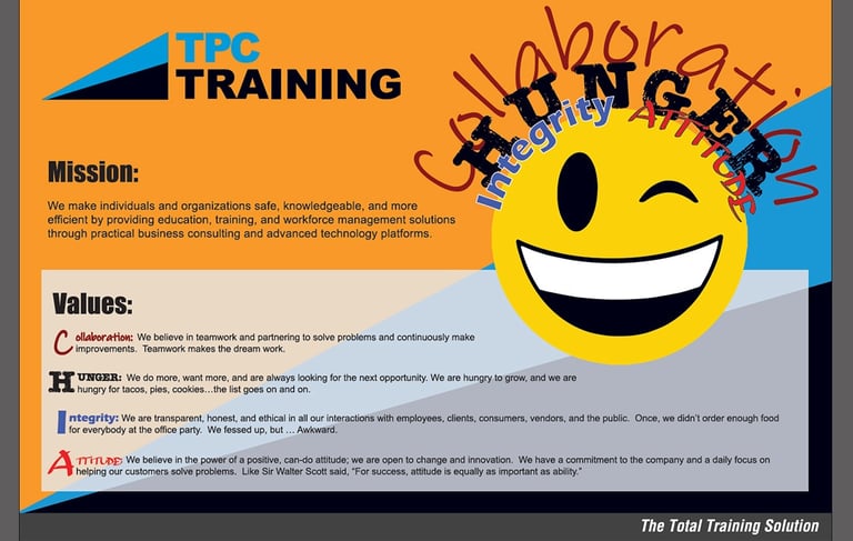
Mission & Values Poster
Back when I was at TPC Training, I got to tackle one of those projects that sounds simple but can actually be a real design puzzle—I created their Mission & Values poster. The challenge was to take all the corporate language and then bring it to life visually so employees would actually want to stop and look at it instead of just walking by. I leaned into bright colors, clean design, and strong typography, so it felt bold but approachable.
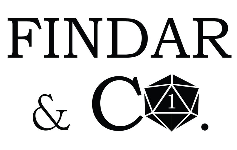
Findar & CO.
Creating the logo for Findar & Co. was just plain fun—this was a gaming group built around live-play Dungeons & Dragons, so I had the freedom to lean into fantasy vibes while keeping it modern and versatile. I worked in elements that nod to classic D&D—shapes that hint at dice, the hysterical and dreaded "1" in gaming, and a type treatment that feels like it could sit on the cover of a campaign book.
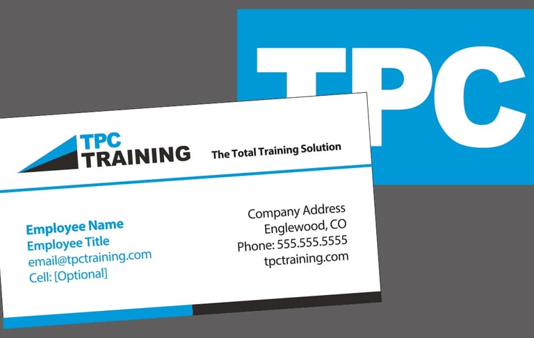
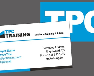
Business Cards
At TPC Training, I designed a fresh set of business cards—and honestly, this was familiar territory for me. Over the years I’ve created more business card designs than I can count, so I know how much impact they can carry. For TPC, I focused on making the layout clean, professional, and instantly recognizable, with strong use of color and typography that aligned with their brand. I also incorporated upslope triangle shapes as a subtle graphic element, representing numbers on a graph climbing upward—a visual nod to growth, progress, and success.
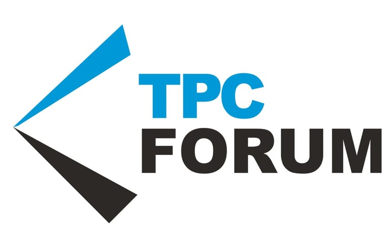
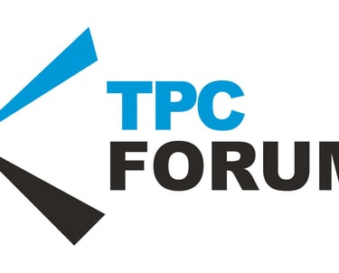
TPC Forum
For the TPC Forum logo, I wanted to build on the recognizable graphic identity already established with TPC Training, but give it a clever twist that spoke directly to the idea of conversation and exchange. I creatively altered the familiar mark so it suggested the shape of a mouth in mid-speech—subtle enough to stay professional, but clear enough to instantly connect with the theme of dialogue. The result was a logo that felt both familiar and fresh: rooted in the parent brand but re-imagined to capture the spirit of sharing ideas, learning, and open communication.
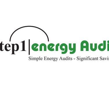
Step 1 Energy Audit
Designing the Step 1 Energy Audit logo was all about clarity and momentum—something that instantly communicated both action and efficiency. I built the mark around the idea of a “first step,” using bold, upward movement in the design to suggest progress and improvement, the arc to suggest the transition, and green to lean into savings. The end result gave Step 1 a professional, forward-looking identity that makes the process feel less intimidating and more like the smart first move toward savings and sustainability.

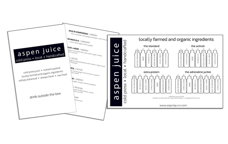
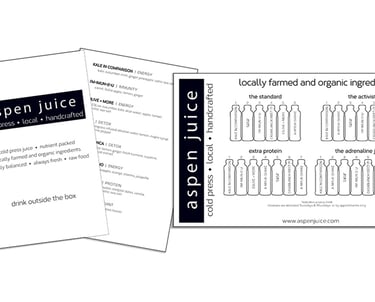
Aspen Juice Logo & Menu Card
For Aspen Juice, I designed both the logo and the product/menu card with the customer’s vision front and center—they wanted something bold, stark, fresh, and modern. For the product/menu card, I carried that same approach forward, using strong contrasts, clear hierarchy, and plenty of open space to let each juice type stand on its own. The end result gave Aspen Juice an identity that feels crisp and contemporary.
Nosostat Software
For Nosostat Software, I designed materials that highlight its role as a powerful tool for long-term care facilities to track infections, incidents, device usage, fall risk assessments, and more. The focus was on presenting complex, clinical information in a way that felt approachable and trustworthy. Clean layouts, clear typography, and straightforward iconography made the features easy to understand, while the overall design reinforced reliability and professionalism.